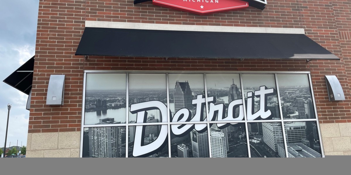
Your signs for storefront is more than just a marker; it's a powerful marketing tool that can significantly impact your business's success. A well-designed sign not only attracts attention but also communicates your brand identity, entices customers to enter your store, and ultimately drives sales. This blog post delves into the art of storefront sign design, exploring key design principles, typography tips, color psychology, and branding strategies to help you create a captivating first impression.
Key Design Principles (Continued)
Effective sign design relies on several key principles:
- Simplicity: Keep the design clean and uncluttered. Avoid overcrowding the sign with too much text or imagery.
- Legibility: Ensure the sign is easily readable from a distance, even in varying light conditions. Choose clear fonts and appropriate sizing.
- Visibility: Position the sign to maximize visibility from all angles. Consider factors such as building setbacks, traffic flow, and surrounding signage.
- Contrast: Use contrasting colors to make the text and graphics stand out against the background.
- Balance: Create a visually balanced design that is pleasing to the eye.
- Hierarchy: Establish a clear hierarchy of information, prioritizing the most important elements.
Typography Tips for Storefront Signs
Typography plays a crucial role in sign legibility and overall design. Consider these tips:
- Choose Legible Fonts: Opt for fonts that are easy to read from a distance. Avoid overly decorative or script fonts. Sans-serif fonts are often a good choice for signage.
- Use Appropriate Font Sizes: Ensure the font size is large enough to be easily read from a distance. Consider the viewing distance and adjust the font size accordingly.
- Limit the Number of Fonts: Stick to a maximum of two fonts to avoid a cluttered look.
- Consider Kerning and Tracking: Adjust the spacing between letters (kerning) and the spacing between words (tracking) to improve readability.
Color Psychology in Storefront Sign Design
Colors evoke different emotions and associations. Understanding color psychology can help you choose colors that effectively communicate your brand message:
- Red: Associated with energy, excitement, and urgency. Often used for restaurants and sales.
- Blue: Associated with trust, stability, and professionalism. Often used for financial institutions and healthcare providers.
- Green: Associated with nature, health, and growth. Often used for eco-friendly businesses and health food stores.
- Yellow: Associated with optimism, happiness, and creativity. Often used for restaurants and children's stores.
- Orange: Associated with enthusiasm, creativity, and affordability. Often used for restaurants and entertainment venues.
- Black: Associated with sophistication, luxury, and power. Often used for high-end businesses and fashion boutiques.
Branding Strategies for Storefront Signs
Your storefront sign should be a direct reflection of your brand identity. Consider these strategies:
- Use Your Logo Prominently: Your logo should be a central element of your sign design.
- Maintain Brand Consistency: Use consistent colors, fonts, and imagery across all your marketing materials, including your storefront sign.
- Communicate Your Brand Message: Your sign should communicate your brand's unique value proposition and target audience.
- Consider Your Target Audience: Design your sign to appeal to your target audience's preferences and aesthetic sensibilities.
Lighting and Illumination
Proper lighting is essential for enhancing visibility, especially at night. Consider these options:
- Backlighting: Illuminating the sign from behind, creating a glowing effect.
- Front Lighting: Illuminating the sign from the front, using spotlights or floodlights.
- Internal Illumination: Illuminating the sign from within, often used for channel letters and sign boxes.
Conclusion
A well-designed storefront sign is a powerful asset for any business. By carefully considering the design principles, typography, color psychology, and branding strategies outlined in this blog post, you can create a captivating first impression that attracts customers, communicates your brand, and drives business success. Remember to consult with a professional sign company to ensure your sign is manufactured and installed correctly and complies with local regulations.


